809 activities in, one page out: a P6 XER rolled up, step by step in screenshots
Your P6 export has 809 activities. The steering committee will give it ninety seconds. This is the whole journey between those two facts — a Primavera P6 .xer goes in, a board-ready one-pager comes out, and every Sketchdule picture below is an actual screenshot of the interface doing it. (The one P6-side view is a faithful recreation — we don't screenshot Oracle's product.) You can follow along with the same file.
The file is the master schedule for the Meridian Gas Processing Plant — Phase 2 Expansion — 809 activities (805 tasks, 4 contract milestones M1–M4) under a WBS built the way planners actually build them: six phases broken into eighteen work packages — FEED, process & systems, three detail-engineering packages, long-lead and bulk procurement, civils, steel, mechanical, piping, E&I and three pre-commissioning packages — each carrying its detail activities, from IFR/IFD/AFC design deliverables to spool fabrication lots and loop-check batches. 1,618 logic links — the two-relationships-per-activity benchmark, with only the first activity and M4 open-ended — statused to a data date of 1 October 2025. Exported as a plain .xer exactly as P6's File → Export produces. If you want to click along, download the sample: Meridian_EPC_Level3.xer (165 KB — an XER is just a tab-delimited text file).
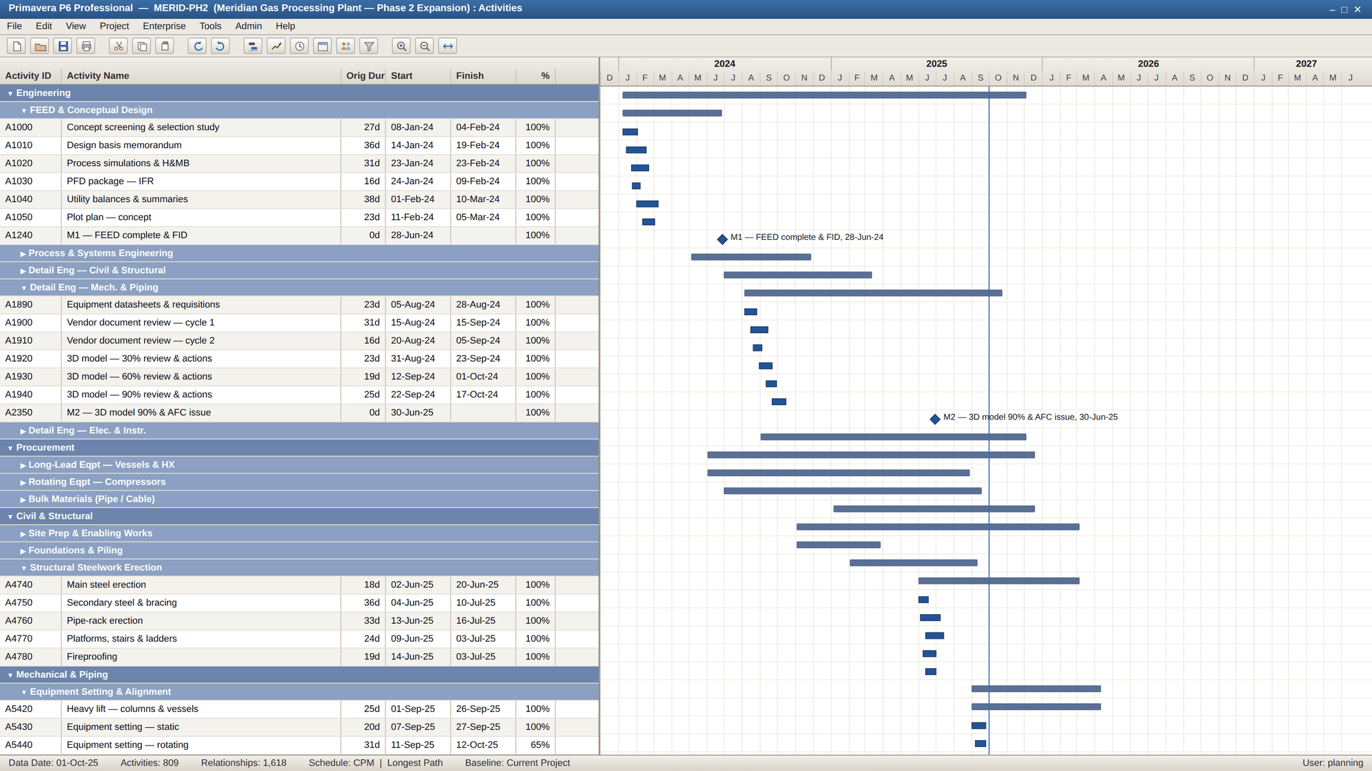
Step 0 — Where it starts: the Level 3 on the scheduling side
This is the file at home, in the scheduling tool — FEED complete in blue with M1 banked, detail engineering split at the data date, and the steelwork-erection chain running red where it drives equipment setting and the piping installs behind it. Collapsed WBS bands hide the rest of the 809. Forty-odd screens of this is what the steering committee is not going to read.
Step 1 — Point Sketchdule at the file
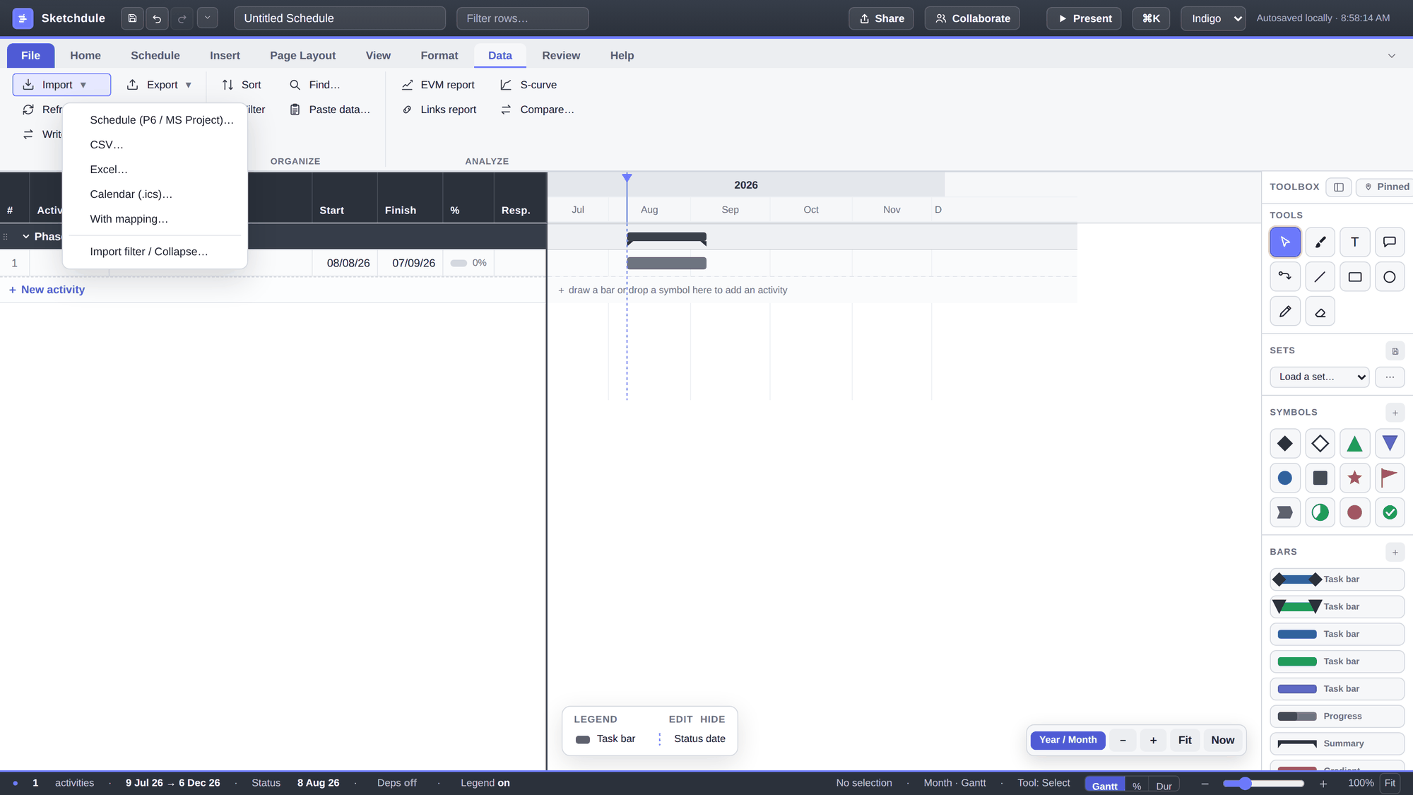
On the Data tab, open Import ▾ and choose Schedule (P6 / MS Project)… — or skip the menu entirely and drag the .xer onto the window. Either way the file is parsed in your browser: nothing uploads, and the programme never leaves your machine.
Step 2 — Choose what to bring in
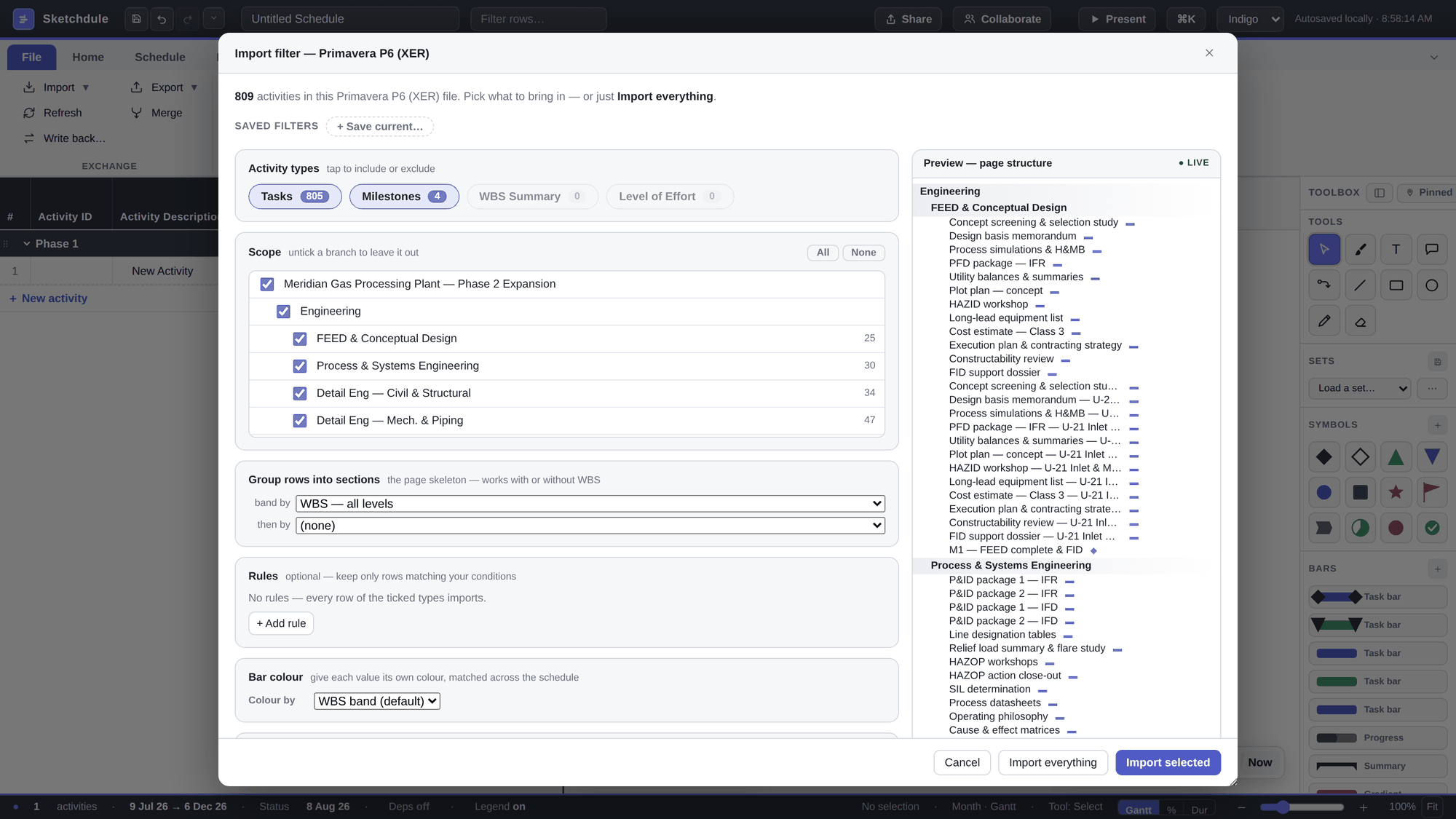
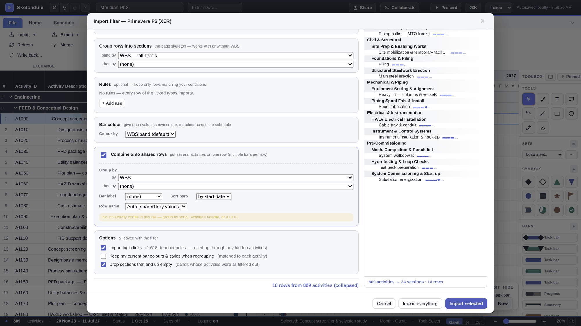
Sketchdule reads the XER and, before building a single row, shows the import filter: the headline count — 809 activities in this Primavera P6 (XER) file — the file's own WBS as a tick-tree, activity-type chips (803 tasks, 6 milestones), optional rules, and a live preview of the page structure on the right. For a first pass you rarely need any of it — Import selected with everything ticked brings in the lot. The point is that the choice exists before import, so the monster can arrive already trimmed to one area or one discipline when that's all the exhibit needs.
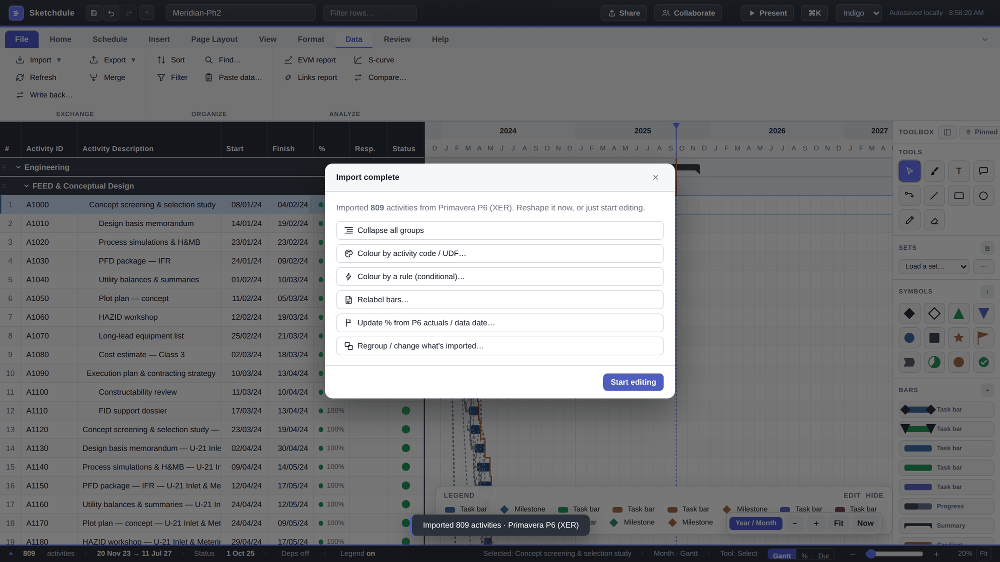
Committing the import lands you on a "what next?" launcher — collapse, colour, relabel, or update progress from the P6 actuals — and the toast confirms what arrived:
Step 3 — This is your Level 3
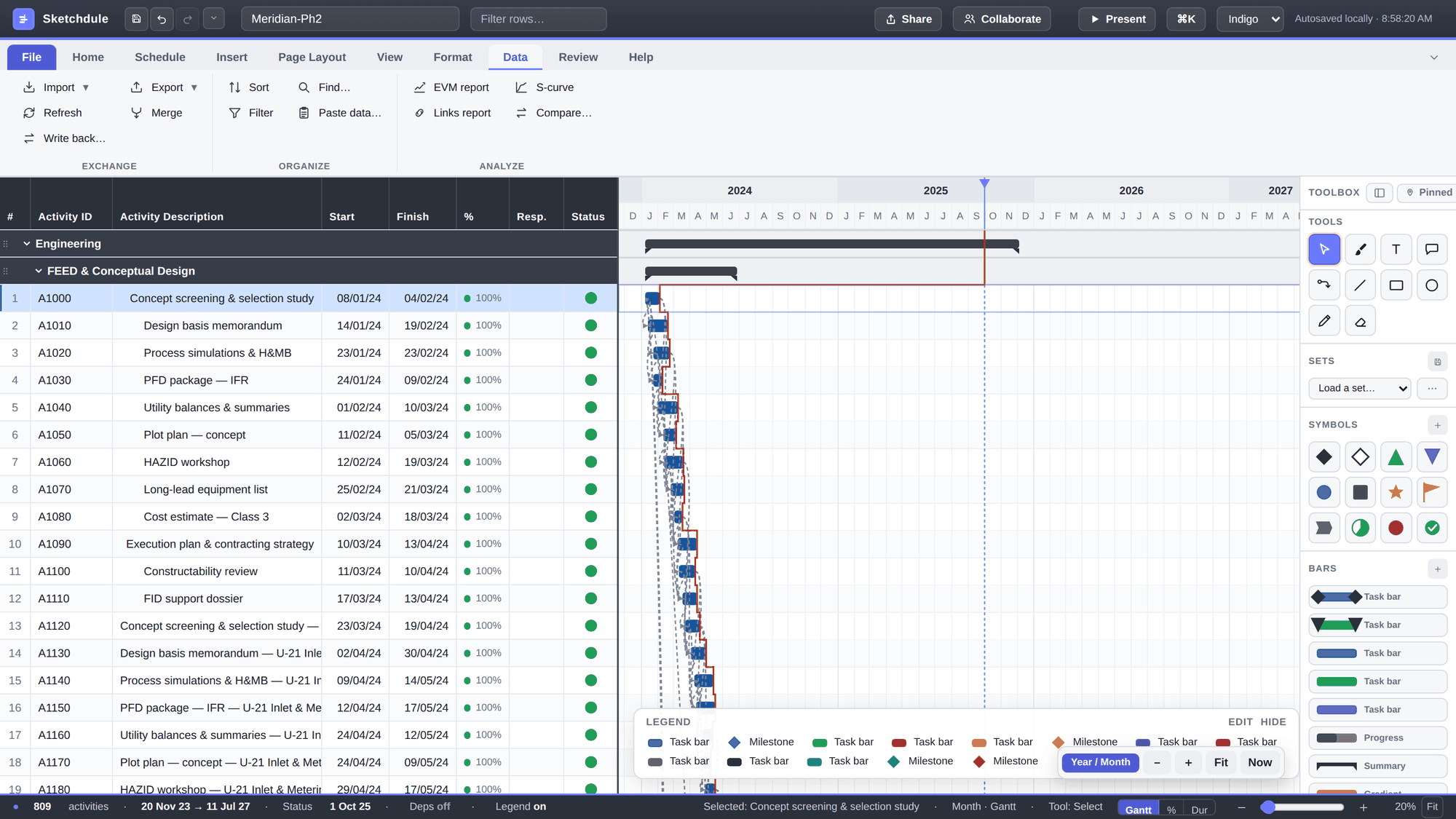
The full detail, exactly as the XER carries it: the WBS as section bands, every activity with its dates and % complete, the logic network as connectors, the imported data date (8 Aug 26, red line) anchoring a progress frontline, and a status stoplight column synthesised from the schedule's own state. No dates were retyped — the grid is the XER.
Step 4 — Roll it up: one dropdown
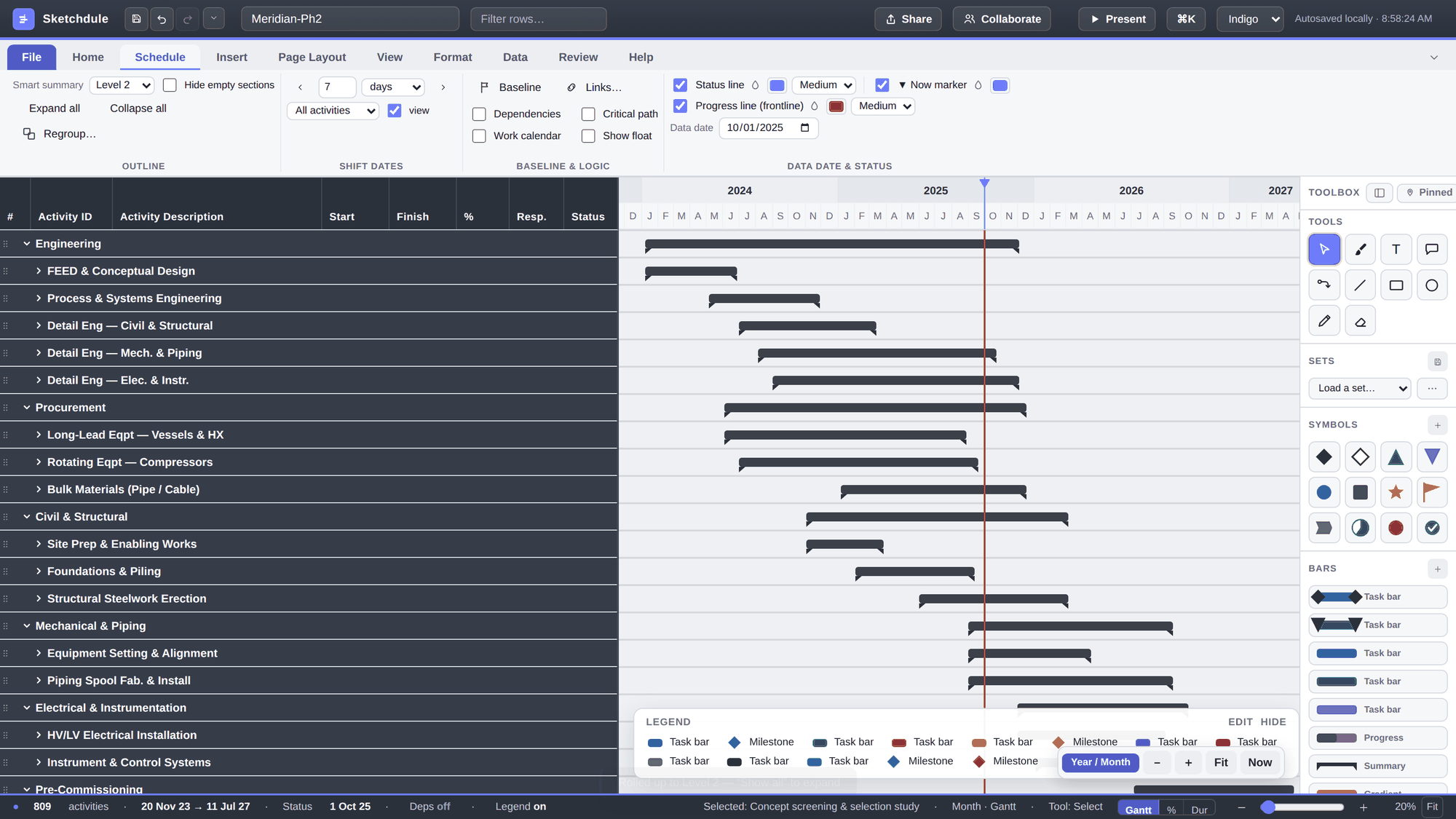
Everything so far was setup. The actual summarisation is one control: Schedule tab ▸ Smart summary. Pick Level 2 and the file folds to its package structure — and because the WBS was built package-wise (FEED, detail engineering by discipline, long-lead equipment, steel, piping, loop checks…), each roll-up bar means something: it isn't one long phase bar, it's the phase's story in two to five spans. Compare this screen with the final page below — the skeleton is already identical. The detail is hidden, not lost.
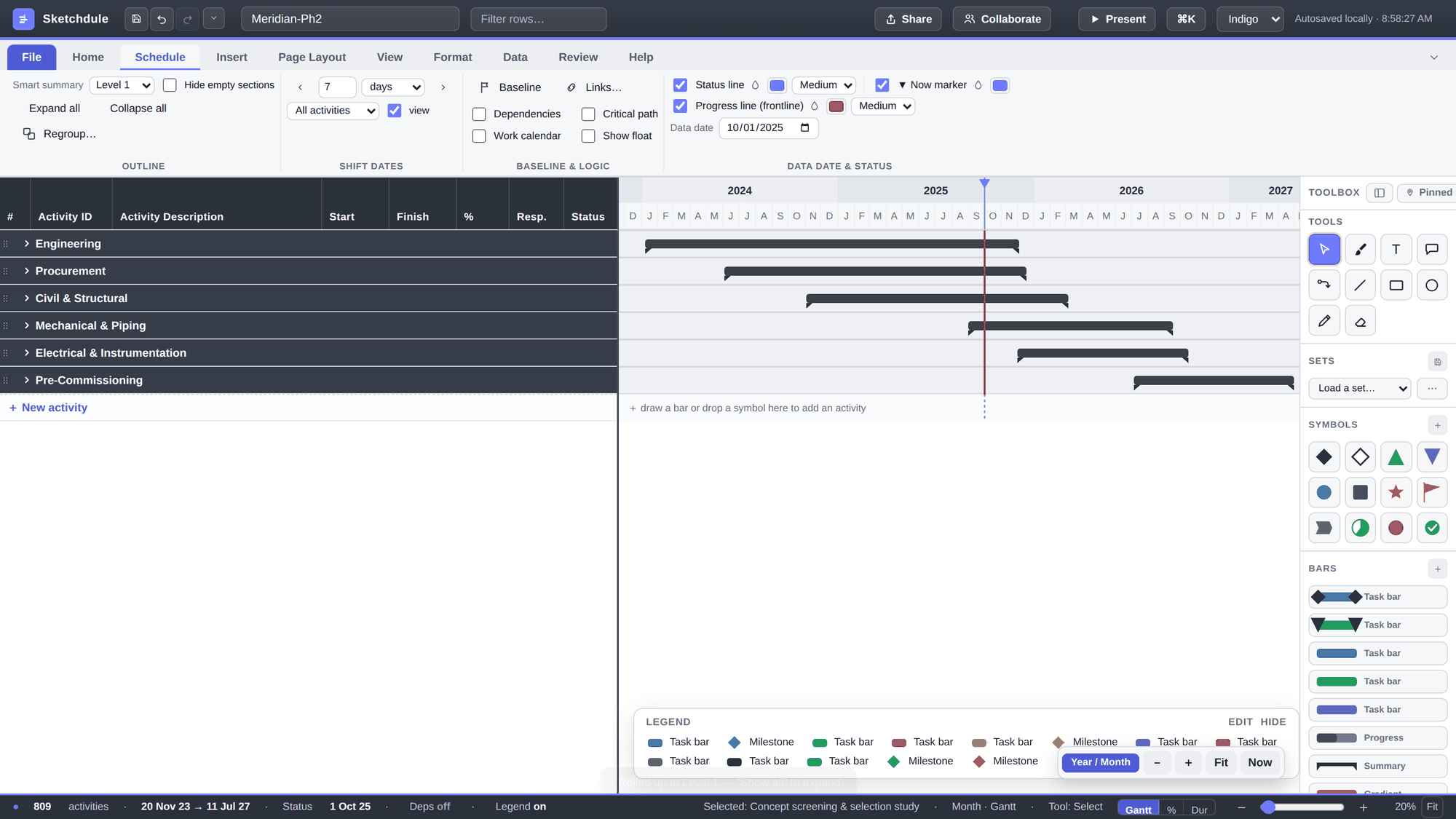
Pick Level 1 and the work packages fold too. 809 activities, six bars — the executive skeleton, still computed live from the imported dates:
Step 5 — Regroup: from a roll-up view to one row per package
Here's the step that turns a collapsed outline into a page. The Smart-summary bars live on section rows — fine for reading, but a presentation wants eighteen real rows you can colour, label and cost-load. So ask the import for exactly that: Data ▸ Import ▾ ▸ Import filter / Collapse…, tick Combine onto shared rows and group by WBS. Watch the live preview rewrite itself — the counter at the bottom says it plainly: 18 rows from 809 activities (collapsed).
Import selected, and the same file comes back in board shape: six phase bands, one row per package with one bar spanning it — and M1–M4 automatically riding their packages as diamonds, because milestones collapse onto the row that owns them. Nothing was drawn by hand; this is still the XER, regrouped.
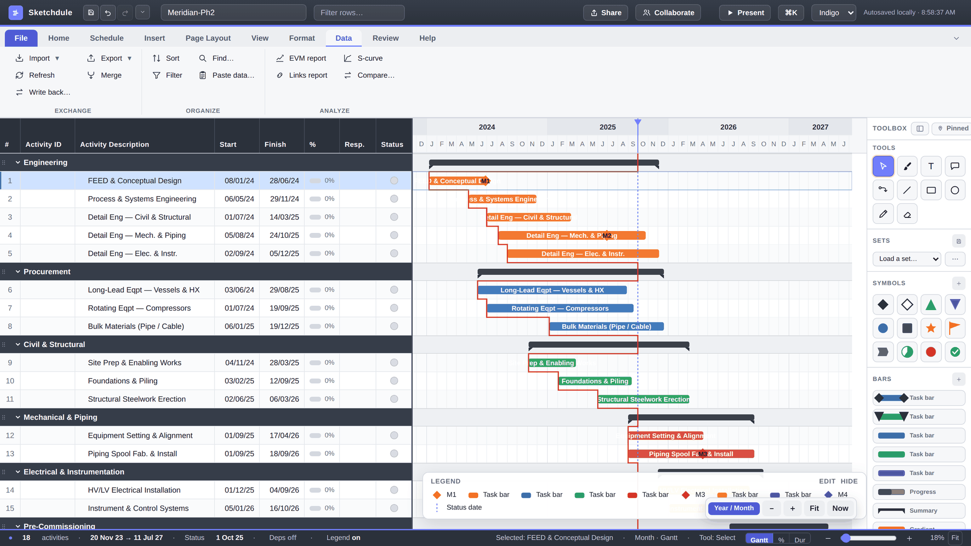
Step 6 — Dress it: colours, milestones, costs, a legend that tells the truth
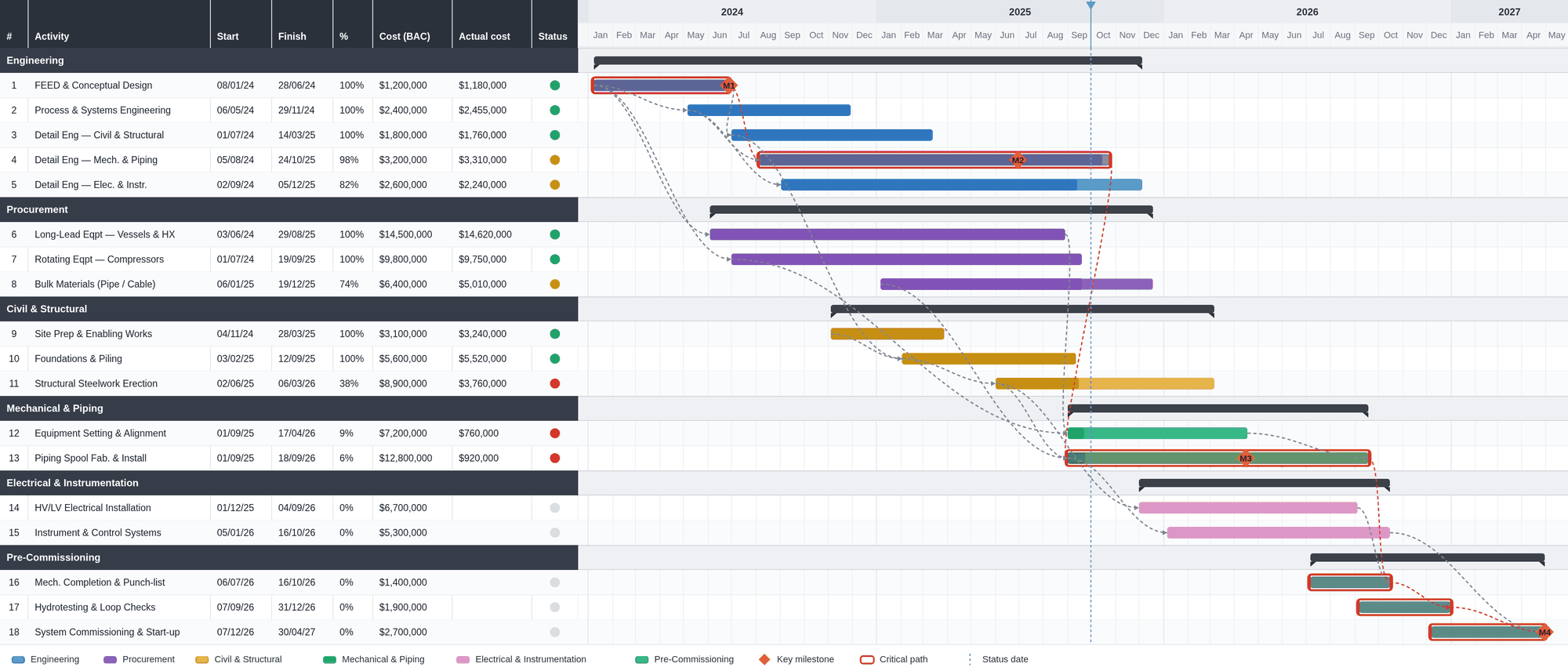
Now make it a board page, with standard features only. Colour the package bars by phase — engineering blue, procurement violet, civils amber, mechanical green, E&I rose, pre-commissioning teal. Mark the contract milestones M1–M4 on their bars. Switch on the critical path so the driving chain — detail engineering → piping → pre-commissioning → M4 — reads in red outline. Add the money: Cost (BAC) and Actual-cost columns next to %. And edit the legend so it says exactly what's on the page — six phase colours, the milestone diamond, the critical-path outline, the status date. No orphan entries, nothing on the chart the legend doesn't explain.
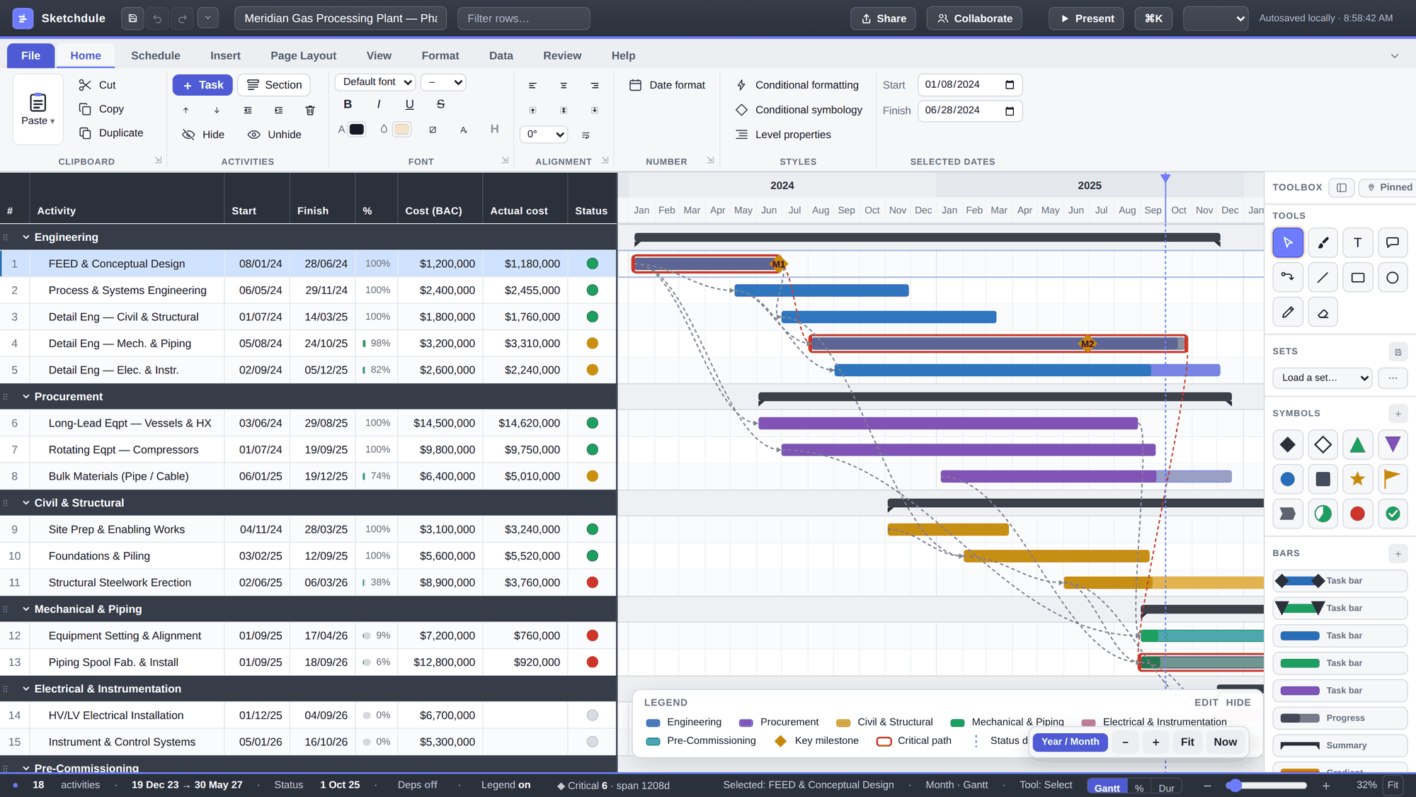
Step 7 — Ship the page
Export it however the audience wants it — a landscape PDF, a PowerPoint slide with editable native shapes, a PNG, or a read-only link that rebuilds the live picture in the recipient's browser. This is the PNG the app produced from the view above, unedited:
What the screenshots didn't show
- Dressing it up. Branding the page with a header, footer and logo, RAG stoplights, gate curtains, callouts — that's the board-pack article's territory. The point here was the pipeline: file → filter → roll-up → page.
- Selective import. The Step-2 filter can group by activity codes instead of WBS, keep only one area, or collapse the whole file to one bar per group on the way in — the fast path from a 5,000-activity XER to a Level 0/1 exhibit. See importing just milestones and summaries.
- The theory. Why a summary is a zoom level, what P6 itself can and can't do about presentation, and the three classic ways a roll-up lies — covered in the Level 3 → Level 1 article and five ways a summary schedule lies.
Key takeaways
- The whole pipeline is five moves: Import the .xer → tick the filter → Smart summary → regroup to one row per package → dress & export. 809 activities became eighteen package bars and four milestones, and every Sketchdule screenshot above is the real interface, in order.
- The import filter shows the file's own WBS and type counts before anything is built — trim on the way in, not after.
- Roll-up is a dropdown, not a rebuild: summary bars are computed live from the imported dates and reverse with "Show all".
- Structure the P6 WBS package-wise (design stages, award/fabrication/delivery, discipline scopes) — then the Level-2 roll-up IS the board skeleton, and every milestone traces to an activity ID.
- Everything parses and renders locally in the browser — the XER never leaves your machine.
Do it with your own XER
Open Sketchdule in a browser — free, no install, nothing uploaded. Or replay this exact walkthrough with the sample file.
Primavera and P6 are trademarks of Oracle Corporation; Microsoft Project is a trademark of Microsoft Corporation. Sketchdule is an independent product and is not affiliated with, endorsed by or sponsored by Oracle or Microsoft. All Sketchdule screenshots are unretouched captures of the app importing the 809-activity sample XER linked above. The Step 0 figure is a recreated, representative P6-style view drawn from the same file for illustration — it is not a screenshot of Oracle’s software. The Meridian project, its dates, durations and logic are entirely fictitious, generated to illustrate the workflow — not a real programme and not scheduling advice.